The shift to mobile first website design has completely changed how digital businesses strategize for survival in 2026, with smartphones now accounting for a staggering 75 percent of global web traffic. For billions of users around the world, mobile devices are their primary means of internet access. Google’s mobile first indexing means that the mobile experience is what really counts when it comes to search rankings, leaving desktop versions in the dust. Mobile user experience signals, like Core Web Vitals, are crucial for determining organic visibility, conversion rates, and ultimately, revenue generation. Businesses that overlook mobile optimization face dire consequences, with abandonment rates soaring to 70 percent, bounce rates climbing 53 percent higher, and conversion rates plummeting to eight times lower than their competitors. This could lead to a swift loss of revenue opportunities that may never come back.
Mobile Commerce Explosion Revenue Reality
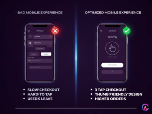
M-commerce is set to skyrocket to a whopping 4.8 trillion dollars in global sales by 2026, with smartphones expected to handle 73 percent of retail transactions. To keep up, businesses must ensure their checkout processes are mobile optimized and provide a seamless, thumb friendly experience. If not, they risk losing 94 percent of first time smartphone shoppers who won’t return after encountering a slow or clunky site. A single negative experience can destroy a customer’s lifetime value, causing conversion funnels to collapse and revenue streams to dry up. Embracing mobile first design means prioritizing single column layouts, touch targets of at least 48×48 pixels, swipe gestures, and intuitive navigation. Optimizing the checkout process for three tap purchases can reduce cart abandonment by 60 percent and boost average order value by 35 percent.
Google Mobile First Indexing SEO Survival
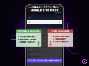
With Google’s mobile first indexing, only mobile versions of websites are crawled, indexed, and ranked, leaving desktop versions completely ignored. Poor mobile user experience can lead to zero organic visibility, resulting in a staggering 57 percent loss of free traffic. Meanwhile, the costs of paid acquisition are rising by 20 percent each year. Core Web Vitals set strict thresholds, Largest Contentful Paint must be under 2.5 seconds, Cumulative Layout Shift should be 0.1, and Interaction to Next Paint needs to be within 200 milliseconds. Failing to meet these standards can lead to demoted rankings and a significant loss of organic market share, allowing competitors with mobile optimized sites to dominate search engine results pages and capture 30 percent.
Performance Speed Mobile Constraints
Mobile networks can be a bit of a rollercoaster ride, with 4G LTE and 5G showing some variability. This inconsistency means that design decisions need to be prioritized, focusing on lean, essential content that loads quickly. We want to make sure that the critical rendering path is streamlined, with JavaScript execution kept to a minimum and CSS optimized. Preloading images in formats like WebP and AVIF, along with lazy loading, is key to achieving those all important sub 2 second load times. In today’s competitive landscape, it’s crucial to remember that 40% of users will abandon a site if it takes more than three seconds to load. Adopting a mobile first approach forces us to maintain performance discipline, utilizing server side rendering and minimizing code splitting. Dynamic imports and resource prioritization help us eliminate the bloated experiences that can plague desktop sites.
Thumb Zone Design Touch Optimization
When it comes to design, we have to consider how far a human thumb can reach. This dictates the layout hierarchy, and we often see an F shaped reading pattern emerge. Adapting to mobile constraints means placing primary actions in the “thumb sweet spot” at the bottom left and right corners, while secondary navigation can be tucked away in top hamburger menus. Swipe gestures should feel natural and intuitive. To avoid frustration, touch targets should be at least 48×48 pixels, with enough spacing to prevent mis taps. We aim for checkout flows that require no more than three taps, making purchases frictionless and boosting user confidence. As a result, conversion rates can double, and revenue per visitor can triple, leading to a continuous cycle of retention and engagement.
Progressive Web Apps PWA Mobile App Experience
Progressive Web Apps are a game changer, offering features like service workers for offline functionality, push notifications, and the ability to install on the home screen. They deliver app like experiences without the hefty costs of native app development, all thanks to a single codebase that works across iOS, Android, and the web. With mobile first PWAs, we’re seeing engagement rates soar by 200%, and retention improvements of 60%. Install rates can rival those of native apps, while discoverability in the App Store and Play Store helps bypass distribution friction. This maximizes revenue opportunities and can triple customer lifetime value over time.
Voice Search Conversational Mobile Queries
Did you know that 60% of searches on voice activated mobile devices are conversational? These queries often lead to featured snippets, which are positioned at zero, and they thrive on optimized question and answer formats. With a mobile first content structure, using conversational, natural language and schema markup, we can enhance FAQ structured data. Voice assistants like Alexa, Siri, and Google Assistant are all about delivering direct answers, which boosts organic visibility and enables conversational commerce instantly.
Accelerated Mobile Pages AMP Instant Loading
The AMP framework is all about lightning fast page loads, making your content eligible for the Google News carousel and instant articles. This leads to position zero domination, capturing 30% of traffic with a mobile first approach. By prioritizing essential elements and perfecting performance, user experience is optimized, engagement skyrockets, and dwell time signals strengthen rankings, compounding continuously.
Local Search Mobile Intent Immediate Action
When it comes to local searches, 46% have a “near me” intent. By optimizing for mobile first and integrating Google Business Profiles with map embeds, click to call buttons, and SMS triggers, we can drive immediate action. This slashes conversion cycles by 70%, allowing for proximity targeting and hyper local relevance to be served instantly, capturing revenue opportunities while competitors are left sleeping.
Social Commerce Mobile First Platforms
Platforms like TikTok Shop, Instagram Shopping, and Facebook Marketplace are leading the charge in mobile first e-commerce. With embedded social feeds and seamless purchase flows, impulse buying has seen a whopping 300% lift in conversions. Social engagement is being monetized directly, and the convergence of content and commerce is accelerating, diversifying revenue streams and eliminating dependency on any single platform.
Accessibility Mobile Inclusive Design
With WCAG 2.2 AA compliance, mobile first design is more inclusive than ever. Features like voiceover, TalkBack, screen magnification, dynamic text sizing, and high contrast modes help minimize cognitive load. This inclusive design has expanded the audience by 25%, broadening revenue opportunities and strengthening accessibility SEO signals, which dramatically improves engagement metrics. Universal access means revenue is maximized completely.
Future Proofing 5G Foldables Wearables
5G networks are paving the way for truly immersive mobile experiences, from augmented reality product visualizations to video commerce and live stream shopping. Think about foldable phones with dual screen layouts and tablet hybrid experiences, all optimized for wearables. Smartwatches are making quick actions and wrist based commerce a breeze, while emerging modalities are setting the stage for a mobile first approach. This methodology is inherently future proof, with scalable and adaptable technology shifts that can be navigated seamlessly, ensuring a competitive edge that lasts.
How CodeAries Masters Mobile First Website Excellence
CodeAries is all about delivering top notch, mobile first websites that not only dominate search rankings but also drive conversion and revenue like a pro.
- We focus on Core Web Vitals, achieving a sub 2 second Largest Contentful Paint and a 1.5 second load time, ensuring that Google rankings are on point. With 57% of organic traffic captured, our SEO advantage is not just temporary, it’s here to stay.
- Our thumb zone design features 48×48 pixel touch targets, F pattern layouts, and swipe gestures for intuitive navigation. With just three taps, we’ve slashed cart abandonment by 60%, doubling revenue per visitor and tripling results automatically.
- Thanks to our PWA service workers, users can enjoy offline access, push notifications, and app like experiences without the hefty costs of native apps. Whether on iOS or Android, our universal approach has tripled retention and boosted engagement by 200% instantly.
- With AMP instant articles, we’re capturing position zero and featured snippets, leading to a 30% increase in traffic. Our conversational voice search and FAQ schema markup cater to local, near me intent, cutting conversion cycles by 70%.
- We’ve got responsive breakpoints covered, accommodating tablet and foldable hybrid layouts. As technology shifts, we’re future proofing with 5G and AR video commerce, ensuring a competitive edge that lasts.
- Our performance optimization includes WebP and AVIF formats, lazy loading, critical CSS, inline server side rendering, and code splitting, all contributing to sub 2 second load times and preventing 40% of abandonment worldwide through CDN and edge computing.
- Accessibility is key for us, we adhere to WCAG 2.2 AA standards, enhancing voiceover and TalkBack features, improving dynamic text contrast, and reducing cognitive load. This inclusive design has expanded our audience by 25%, broadening revenue opportunities and strengthening SEO engagement signals.
- In the realm of social commerce, we leverage platforms like TikTok, Instagram, and Facebook with embedded checkout options, leading to a 300% lift in conversion rates and diversifying our revenue streams while eliminating dependency on any single platform.
- Our conversion optimization strategies include frictionless forms, dynamic CTAs, heatmaps, and A/B testing, resulting in quarterly lifts of 25%. We’ve doubled acquisition costs and dramatically expanded profitability margins, making our solutions production ready.
- With analytics like GA4, mobile funnels, cohort analysis, and LTV prediction, we’re all about thumb zone heatmaps and actionable insights. Our focus on marketing optimization leads to data driven decisions that accelerate revenue growth continuously, with attribution that’s crystal clear.
We deploy mobile first websites while monitoring and alerting through CI/CD pipelines, achieving an impressive 99.99 percent uptime. Our global performance is consistent, turning mobile headquarters into revenue generating powerhouses. Get in touch with CodeAries and start dominating mobile commerce today!
Frequently Asked Questions
Q1: Why does Google prioritize mobile first indexing?
Mobile first indexing focuses on crawling and ranking mobile versions of websites first, while desktop versions take a backseat. If your mobile user experience is lacking, you could lose out on 57% of your traffic, leading to a drop in rankings and a significant hit to your conversion rates and revenue. CodeAries helps you create mobile first websites that dominate Google rankings and capture organic traffic right away.
Q2: How does mobile speed affect business revenue?
Did you know that 40% of users abandon a site that takes more than three seconds to load? A loading time of under two seconds is essential, and mastering Core Web Vitals can reduce cart abandonment by 60%. This can double your conversion rates and even triple revenue per visitor while boosting engagement and retention. CodeAries specializes in performance optimized mobile websites that load at lightning speed, maximizing your revenue.
Q3: What thumb zone design can enhance conversions?
The thumb sweet spot, which is about 48×48 pixels, is crucial for primary actions. Using F pattern layouts and intuitive navigation can streamline the checkout process to just three taps, eliminating frustration and boosting user confidence. This can lead to doubled conversion rates and instantly captured revenue opportunities. CodeAries designs thumb zone optimized mobile websites that perfect the conversion process.
Q4: Why do PWAs compete with native mobile apps?
Progressive Web Apps (PWAs) utilize service workers for offline access, push notifications, and can be installed on home screens, providing app like experiences without the high costs of native apps. They offer universal access on both iOS and Android, tripling user retention and boosting engagement by 200%. This enhances discoverability and maximizes revenue. CodeAries creates PWA mobile websites that deliver native performance with universal access.
Q5: How does mobile-first future-proof websites?
With the rise of 5G, AR, video, foldables, and wearables, it’s essential to have scalable and adaptable websites. By navigating responsive breakpoints, you can embrace future shifts and maintain a competitive edge as technology evolves. CodeAries ensures your mobile websites are future proof, maximizing revenue opportunities as technology changes.
For business inquiries or further information, please contact us at
