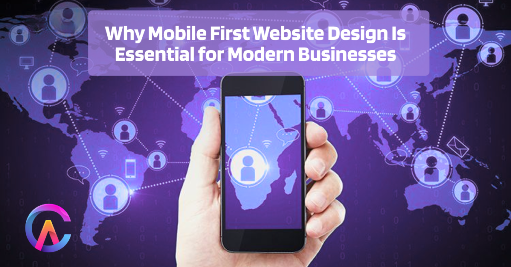
Why Mobile First Website Design Is Essential for Modern Businesses
Read 8 MinThe shift to mobile first website design has completely changed how digital businesses strategize for survival in 2026, with smartphones now accounting for a staggering 75 percent of global web traffic. For billions of users around the world, mobile devices are their primary means of internet access. Google’s mobile first indexing means that the mobile experience is what really counts when it comes to search rankings, leaving desktop versions in the dust. Mobile user experience signals, like Core Web Vitals, are crucial for determining organic visibility, conversion rates, and ultimately, revenue generation. Businesses that overlook mobile optimization face dire consequences, with abandonment rates soaring to 70 percent, bounce rates climbing 53 percent higher, and conversion rates plummeting to eight times lower than their competitors. This could lead to a swift loss of revenue opportunities that may never come back. Mobile Commerce Explosion Revenue Reality M-commerce is set to skyrocket to a whopping 4.8 trillion dollars in global sales by 2026, with smartphones expected to handle 73 percent of retail transactions. To keep up, businesses must ensure their checkout processes are mobile optimized and provide a seamless, thumb friendly experience. If not, they risk losing 94 percent of first time smartphone shoppers who won’t return after encountering a slow or clunky site. A single negative experience can destroy a customer’s lifetime value, causing conversion funnels to collapse and revenue streams to dry up. Embracing mobile first design means prioritizing single column layouts, touch targets of at least 48×48 pixels, swipe gestures, and intuitive navigation. Optimizing the checkout process for three tap purchases can reduce cart abandonment by 60 percent and boost average order value by 35 percent. Google Mobile First Indexing SEO Survival With Google’s mobile first indexing, only mobile versions of websites are crawled, indexed, and ranked, leaving desktop versions completely ignored. Poor mobile user experience can lead to zero organic visibility, resulting in a staggering 57 percent loss of free traffic. Meanwhile, the costs of paid acquisition are rising by 20 percent each year. Core Web Vitals set strict thresholds, Largest Contentful Paint must be under 2.5 seconds, Cumulative Layout Shift should be 0.1, and Interaction to Next Paint needs to be within 200 milliseconds. Failing to meet these standards can lead to demoted rankings and a significant loss of organic market share, allowing competitors with mobile optimized sites to dominate search engine results pages and capture 30 percent. Performance Speed Mobile Constraints Mobile networks can be a bit of a rollercoaster ride, with 4G LTE and 5G showing some variability. This inconsistency means that design decisions need to be prioritized, focusing on lean, essential content that loads quickly. We want to make sure that the critical rendering path is streamlined, with JavaScript execution kept to a minimum and CSS optimized. Preloading images in formats like WebP and AVIF, along with lazy loading, is key to achieving those all important sub 2 second load times. In today’s competitive landscape, it’s crucial to remember that 40% of users will abandon a site if it takes more than three seconds to load. Adopting a mobile first approach forces us to maintain performance discipline, utilizing server side rendering and minimizing code splitting. Dynamic imports and resource prioritization help us eliminate the bloated experiences that can plague desktop sites. Thumb Zone Design Touch Optimization When it comes to design, we have to consider how far a human thumb can reach. This dictates the layout hierarchy, and we often see an F shaped reading pattern emerge. Adapting to mobile constraints means placing primary actions in the “thumb sweet spot” at the bottom left and right corners, while secondary navigation can be tucked away in top hamburger menus. Swipe gestures should feel natural and intuitive. To avoid frustration, touch targets should be at least 48×48 pixels, with enough spacing to prevent mis taps. We aim for checkout flows that require no more than three taps, making purchases frictionless and boosting user confidence. As a result, conversion rates can double, and revenue per visitor can triple, leading to a continuous cycle of retention and engagement. Progressive Web Apps PWA Mobile App Experience Progressive Web Apps are a game changer, offering features like service workers for offline functionality, push notifications, and the ability to install on the home screen. They deliver app like experiences without the hefty costs of native app development, all thanks to a single codebase that works across iOS, Android, and the web. With mobile first PWAs, we’re seeing engagement rates soar by 200%, and retention improvements of 60%. Install rates can rival those of native apps, while discoverability in the App Store and Play Store helps bypass distribution friction. This maximizes revenue opportunities and can triple customer lifetime value over time. Voice Search Conversational Mobile Queries Did you know that 60% of searches on voice activated mobile devices are conversational? These queries often lead to featured snippets, which are positioned at zero, and they thrive on optimized question and answer formats. With a mobile first content structure, using conversational, natural language and schema markup, we can enhance FAQ structured data. Voice assistants like Alexa, Siri, and Google Assistant are all about delivering direct answers, which boosts organic visibility and enables conversational commerce instantly. Accelerated Mobile Pages AMP Instant Loading The AMP framework is all about lightning fast page loads, making your content eligible for the Google News carousel and instant articles. This leads to position zero domination, capturing 30% of traffic with a mobile first approach. By prioritizing essential elements and perfecting performance, user experience is optimized, engagement skyrockets, and dwell time signals strengthen rankings, compounding continuously. Local Search Mobile Intent Immediate Action When it comes to local searches, 46% have a “near me” intent. By optimizing for mobile first and integrating Google Business Profiles with map embeds, click to call buttons, and SMS triggers, we can drive immediate action. This slashes conversion cycles by 70%, allowing for proximity targeting and hyper local relevance to be served instantly, capturing revenue opportunities while


